Characteristics of a perfect Responsive Web design.

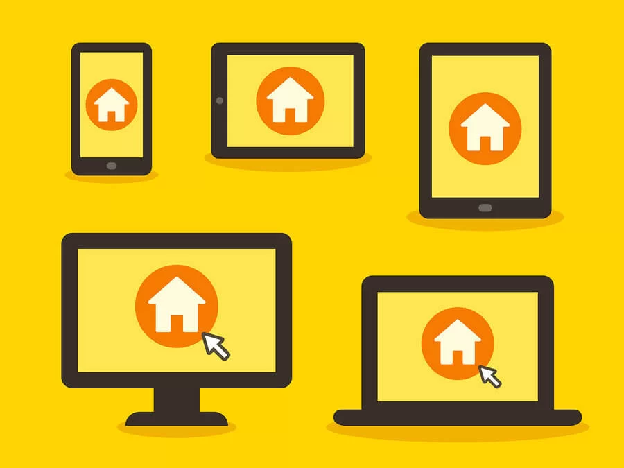
Most of the people are accessing the internet via their mobile devices and smartphones, nowadays. They can even become commonplace for accessing the internet as these devices are becoming more affordable. People can use mobile devices for multiple purposes like they can search for restaurants, night club, movie theatres, or any other establishment. They are directed to the business website. Businesses that create websites with principles of Responsive web design are more prepared to engage with millions of people using mobile devices.
What is Responsive Design?
Responsive web design is a set of principles that are followed in order to create a website that needs minimum scrolling and resizing and to be visible on a wide range of devices. It makes it simple and user-friendly to access a website using a laptop, desktop, or smartphone. This is what the Responsive web design aims to achieve.
Features of a perfect Responsive Website Design:
Less Effort: With the responsive web design, you just need to update the information only once on your website. These changes will appear or be updated in all the versions of your website automatically. It will of course lessen your efforts.
Better and effortless user experience: Perfect responsive design gives users, an optimized and smooth experience on the device they are using. The most famous search engine Google started promoting responsive web design in their own method for cell phone sites.
User-Friendly Website: A responsive web design makes your webpage user-friendly as your website opens perfectly on any device of any screen size. There is a huge competition on technology innovations and a number of smartphones are launched in the market daily. Therefore, if you have a perfect Responsive website design then people will visit your website, which would be beneficial for your business.
Mobile Segment: It is also one of the good features of perfect responsive website design as it allows you to get all the useful information about the traffic on your website. For this, you just have to make a mobile segment and you will get a complete view of traffic coming to your site. Traffic updates are important as it tells you about your website performance. As a result, it will help you to make changes to your site to increase traffic.
Less Maintenance: With the responsive website design, you don’t need to make the changes individually on the website for various devices. You just have to maintain one website and it will be updated automatically on all versions of the site. Therefore, less maintenance is required and the website is updated effectively.
Only vertical scrolling: Perfect Responsive Web design is not just about the device. For instance, if you are opening a website on a huge screen, then it is not that you will always experience the full-screen web browser window. But if you are opening a perfect responsive design, then there is no need to care about the screen size. Responsive design will never allow you to do horrible horizontal scrolling.
Summary: A responsive Website design is a dynamic new approach to website creation that is accessible by both mobile device and desktop users. A perfect responsive design brings more visitors or traffic to your site as it looks great and is accessible from all devices.

